
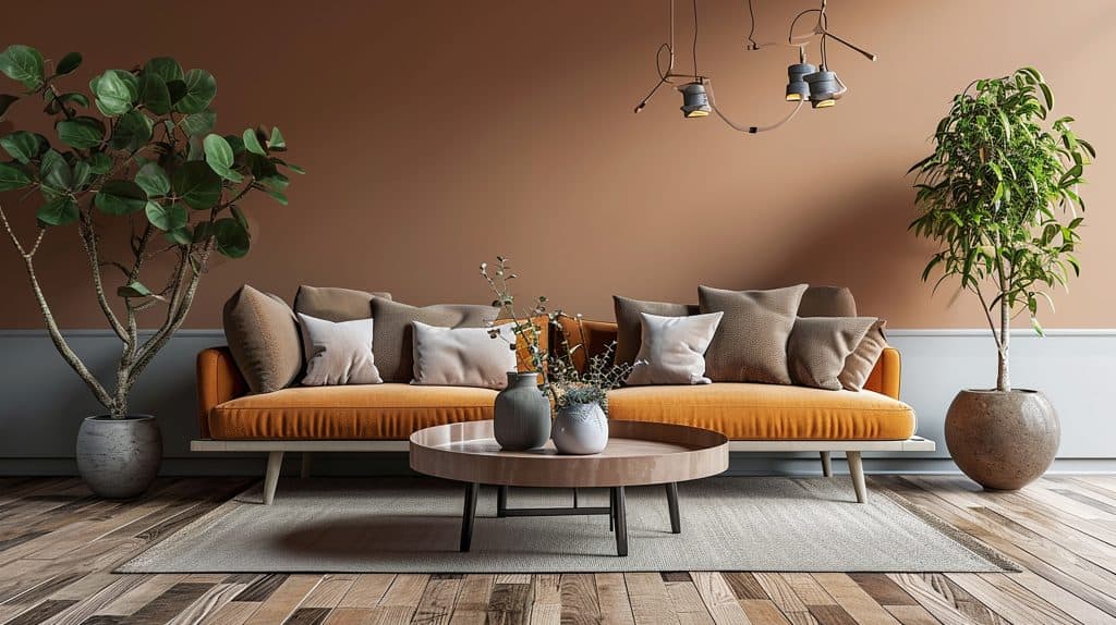
How Colour Psychology Affects the Feel of Your Home
Walk into two rooms of the same size and shape, one painted a cold bright white and the other painted a warm muted neutral, and they will not feel the same. One may feel clinical and hard, while the other may feel calm, grounded and comfortable. That is the practical side of colour psychology in home painting. Colour changes how a room feels, how light behaves, how large or small the space appears, and how comfortable people feel spending time there.
In high-end areas such as Bishopscourt, colour choices matter because the homes often include large rooms, double-volume spaces, established gardens, mountain-facing light, formal lounges, guest suites, home offices, entertainment areas, timber floors, exposed beams, stone, marble, quality furniture and premium finishes. A colour that works beautifully in one room can feel flat, cold, heavy or too bright in another.
This article explains how colour psychology affects the feel of your home in a practical way. It supports homeowners looking for Painters Bishopscourt, Southern Suburbs Painters, Interior Painting, Residential Painters Cape Town and preparation-first interior repainting advice.
Painting Contractors Somerset West assists with suitable painting projects in Bishopscourt and Cape Town where project size, access and timing make sense. We are not a lead-generation painting company. Clients deal directly with an established painting contractor using full-time employed painters, a working foreman on site daily, written diagnostic reports and clear written scopes of work.
What Is Colour Psychology in Home Painting?
Colour psychology in home painting is the way colour influences mood, comfort, warmth, calmness, energy, elegance, focus and the perceived size of a room. It is not only about choosing fashionable colours. It is about understanding how a specific colour behaves in a specific room with its own light, finishes, furniture, purpose and wall condition.
Some colours make a room feel warmer and more welcoming. Others feel cooler, calmer or more formal. Light colours can make a room feel more open, while darker colours can add depth, drama and intimacy. Soft muted colours can calm a bedroom. Warm neutrals can make a living room feel inviting. Muted greens and blues can help a home office feel focused and composed.
The correct colour choice is not only the colour that looks good on a swatch card. It is the colour that still works on the actual wall, in the actual light, with the actual flooring, curtains, furniture, timber, stone, tiles and room purpose.
Why Bishopscourt Homes Need Thoughtful Colour Planning
Bishopscourt homes often have architectural and interior features that make colour selection more important than in a standard repaint. Large rooms need colours that hold their shape across wide wall areas. Double-volume spaces need colours that do not feel too empty or too heavy. Established gardens and mature trees can filter the natural light and make interiors feel cooler or more shaded. Mountain-facing elevations can change the quality of light throughout the day and across seasons.
Formal lounges, dining rooms, entertainment areas, bedrooms, guest suites, home offices, entrance halls and passages each need a different colour approach. A colour that feels elegant in a formal dining room may feel too heavy in a bedroom. A bright white that looks clean in a sunny kitchen may feel cold in a shaded lounge.
High-end homes also need colours that work with existing finishes. Timber floors, stone, marble, built-in cabinetry, exposed beams, tiles, curtains, artwork and furniture all affect how a wall colour reads. Good colour planning respects the whole room, not just the wall.
Warm Colours and How They Affect a Room
Warm colours include warm whites, creams, soft beiges, taupes, muted earth tones and gentle colours with yellow, red, brown or terracotta undertones. These colours usually make a space feel more comfortable, welcoming and lived-in.
Warm neutrals work well in living rooms, entrance halls, dining areas, guest suites and family spaces where the goal is comfort and connection. In shaded Bishopscourt rooms facing gardens or mature trees, a warm neutral can soften the coolness and stop the room from feeling grey or flat.
The key is balance. Too much warmth can make a room feel dated, yellow or heavy. The correct warm neutral should work with the floor, furniture, curtains, natural light and artificial lighting.
Cool Colours and Calm Interiors
Cool colours include soft greys, muted blues, gentle greens, blue-greys, cool whites and some greige tones. These colours can create calm, freshness, elegance and visual order when they are used correctly.
Cool colours often work well in bedrooms, studies, bathrooms, home offices and bright rooms that receive strong natural light. Muted greens can connect interiors to gardens. Soft blues can create calm. Gentle greys can feel contemporary and understated.
The risk is that cool colours can feel cold in rooms that already lack warmth or sunlight. A shaded garden-facing room may make a cool grey look dull or flat. This is why colour testing on the actual wall is essential before painting a full room.
Dark Colours, Feature Walls and Dramatic Spaces
Charcoal, navy, deep green, muted black, dark blue-grey and other deeper tones can add drama, sophistication and architectural focus. In large, well-lit Bishopscourt homes, darker colours can work beautifully in formal dining rooms, studies, feature walls, entertainment areas, stairwells or behind built-in units.
Dark colours can make a large room feel more grounded and intimate. They can also help define zones in open-plan spaces. However, they need enough light, scale and balance to work well. In a small or already dark room, the same colour may make the space feel smaller and heavier.
Dark colours also reveal wall imperfections more clearly. Cracks, uneven plaster, patch marks, sanding scratches and poor previous paintwork can become more visible under darker or higher-sheen finishes. Good preparation matters before using dramatic colours.
Whites and Neutrals Are Not Simple
White is not one colour. Some whites are warm and creamy. Some are cool and grey. Some lean slightly blue, yellow, green or pink. The same white can look crisp in one room and dull or harsh in another.
Natural light changes the way whites and neutrals behave. A north-facing room in Cape Town may make a white look brighter and warmer. A shaded, south-facing or garden-filtered room may make the same white look colder or greyer. Evening artificial light can change the colour again.
This is why small swatch cards are not enough. A colour should be tested on the actual wall and observed at different times of day before committing to an entire room or home.
Colour Choices for Different Rooms
Bedrooms
Bedrooms usually benefit from calm, muted colours that support rest. Soft neutrals, muted greens, gentle blues, warm whites and soft greys often work well. The goal is a restful atmosphere, not visual noise.
Guest Suites
Guest suites often need colours that feel welcoming to different people. Soft warm neutrals, gentle greige tones and muted colours can create a comfortable, calm and elegant guest environment.
Living Rooms
Living rooms need warmth, balance and flow. In Bishopscourt homes, living rooms often connect with gardens, entertainment areas, dining rooms and entrance halls, so the colour should support the whole home rather than feel isolated.
Dining Rooms
Dining rooms can often carry richer or deeper colours because they are used for shorter periods and benefit from atmosphere. Darker muted colours, warm neutrals or elegant feature walls can create a more intimate dining experience.
Kitchens
Kitchens need practical colours and washable finishes. Warm whites, soft neutrals and carefully selected greens or greys can work well with stone counters, cabinetry, timber floors and stainless-steel appliances.
Bathrooms
Bathrooms need colour choices paired with moisture-suitable coatings. Soft whites, pale greys, muted greens and gentle blues can create a spa-like feel, but the paint system must also handle humidity, cleaning and ventilation conditions.
Home Offices and Studies
Home offices often benefit from colours that support focus and clarity. Muted greens, soft blues, blue-greys, warm neutrals and controlled feature colours can help create a professional and calm work environment.
Entrance Halls and Passages
Entrance halls and passages shape the first impression of a home. Soft warm neutrals, elegant whites and consistent tones can help create flow while allowing artwork, lighting and architectural features to stand out.
Double-Volume Spaces
Double-volume spaces need colour considered at scale. A shade that looks soft on a small sample can feel much stronger across a tall wall. Large spaces can carry deeper tones better, but they also expose poor preparation more clearly.
Natural Light, Gardens and Mountain-Facing Rooms
Light changes colour. Morning light, afternoon light, garden-filtered light, mountain-facing light and artificial light can all make the same paint colour appear different.
In Bishopscourt, established gardens and mature trees often filter sunlight before it reaches the windows. This can make rooms feel cooler, greener or more shaded. Mountain-facing rooms can change throughout the day and season. A colour that feels balanced at midday may look colder in the morning or warmer under evening lighting.
Test patches are essential. Apply the colour to the actual wall, not only to a sample board, and view it at different times of day. This prevents expensive surprises after the entire room is painted.
Sheen Level and Wall Condition
Colour is only part of the final result. Sheen level changes how a colour appears and how much light reflects off the wall. Matt and low-sheen finishes usually create a softer, calmer appearance and are more forgiving of minor wall imperfections. Higher-sheen finishes can be more washable, but they reflect more light and highlight uneven plaster, old repairs, roller marks and surface defects.
For high-end interiors, sheen must be chosen carefully. A beautiful colour in the wrong sheen can look too shiny, too flat or too unforgiving. High-traffic areas may need durability, while bedrooms and formal spaces may benefit from softer finishes.
Preparation affects the final colour quality. Cracks, dents, stains, uneven filler, poor sanding, old paint ridges and moisture marks can show through even the best colour if the wall is not prepared correctly first.
Common Colour Mistakes to Avoid
Many colour mistakes happen because the choice is made too quickly or without testing the room properly. Avoid these common errors:
- Choosing a colour from a small swatch card only.
- Ignoring how natural light moves through the room during the day.
- Using the same bright white everywhere regardless of room orientation.
- Choosing dark colours in rooms that are already dark or poorly lit.
- Ignoring floors, curtains, tiles, timber, stone, furniture and cabinetry.
- Ignoring sheen level as part of the colour decision.
- Choosing a fashionable colour that does not suit the home.
- Not testing the colour directly on the actual wall.
- Ignoring cracks, stains, damp, old paint defects and poor wall preparation.
How Painting Contractors Somerset West Approaches Interior Colour Projects
Painting Contractors Somerset West assists with suitable painting projects in Bishopscourt and across Cape Town where project size, access and timing make sense. We are not a lead-generation company. You deal directly with an established painting contractor, not a call centre or unknown subcontractor.
Every quotation is supported by a written diagnostic report and a clear written scope of work. This helps property owners understand the preparation required before painting, the areas included, the coating approach and any visible surface issues that could affect the final result.
Our painters are full-time employees, not subcontractors, and a working foreman is on site daily to oversee preparation, protection, painting, clean-up and quality control. We carry Public Liability Insurance through OUTsurance and work to supplier or manufacturer-backed coating specifications where applicable.
With more than 20 years of painting experience, our approach is preparation-first. We can advise on sample testing, sheen level, wall condition and practical colour suitability, but we also make it clear that beautiful colours still need properly prepared surfaces. Paint does not fix active damp, and poor plaster, cracks, stains or old paint defects must be resolved before the final colour is applied.
Properly prepared interior paintwork can maintain its integrity for approximately 8 to 10 years where damp, cracks, stains, poor adhesion and other defects are resolved first, depending on exposure, room use and maintenance.
Related Painting Services and Cape Town Areas
This article supports interior colour and residential repainting advice for Bishopscourt and the Southern Suburbs. For related location pages, visit Painters Bishopscourt, Southern Suburbs Painters, Painters Constantia, Painters Newlands, Painters Claremont, Painters Rondebosch and Painters Wynberg.
For related services, visit our Painting Services, Interior Painting, Exterior Painting, Residential Painters Cape Town, Body Corporate and Estate Painting Cape Town and Cape Town Painting Service Areas.
Get a Bishopscourt Interior Painting Quotation
If you are planning an interior repaint and want colour advice that considers your home’s light, layout, finishes, room use and wall condition, start with a proper site visit rather than relying only on a swatch card.
Call 082 374 6862 or visit our contact page to request a written quotation.
Colour Psychology and Interior Painting FAQs
What is colour psychology in home painting?
Colour psychology in home painting is the way paint colours influence mood, comfort, warmth, calmness, energy, elegance and the perceived size of a room.
How do paint colours affect the feel of a room?
Paint colours affect how warm, calm, spacious, formal, dramatic or energetic a room feels. They also interact with natural light, artificial light, flooring, furniture and the purpose of the room.
What colours make a bedroom feel calmer?
Muted, soft colours usually make bedrooms feel calmer. Gentle neutrals, soft greens, muted blues, warm whites and soft greys can help create a restful bedroom atmosphere.
What colours make a living room feel warmer?
Warm whites, creams, soft beiges, taupes and muted earth tones can make living rooms feel warmer, more inviting and more comfortable.
Should I use dark colours in a large room?
Large, well-lit rooms can often carry darker colours well. Dark colours can add drama, depth and intimacy, but they need good light, scale and proper wall preparation.
Why do whites look different in different rooms?
Whites have undertones such as cream, yellow, grey, blue or pink. Natural light, room direction, artificial lighting and surrounding finishes can make the same white look different from one room to another.
How does natural light affect paint colour?
Natural light changes throughout the day and affects how colours appear. A colour may look warmer, cooler, brighter or flatter depending on the time of day, room orientation and surrounding garden shade.
Should I test paint colours before painting?
Yes. Paint colours should be tested on the actual wall and viewed at different times of day. This gives a more accurate result than relying only on a small swatch card or online image.
Does sheen level affect how a colour looks?
Yes. Matt and low-sheen finishes create a softer look and hide minor imperfections better. Higher-sheen finishes reflect more light and can highlight wall defects, patch marks and uneven plaster.
What colours work well in home offices?
Muted greens, soft blues, blue-greys and warm neutrals often work well in home offices because they support focus, calm and clarity without feeling too harsh.
Can paint colour make a small room feel bigger?
Yes. Lighter, softer colours can help a small room feel more open, especially when paired with good natural light. Very dark colours can make small rooms feel more enclosed if not used carefully.
Why does wall preparation matter before choosing colours?
Wall preparation affects the final appearance of any colour. Cracks, stains, poor plaster, old paint ridges, damp marks and patch repairs can show through even a beautiful colour if the surface is not prepared correctly.
How do I request a Bishopscourt interior painting quotation?
Call 082 374 6862 or visit the Painting Contractors Somerset West contact page to request a written quotation for a Bishopscourt interior painting project.